tax and cactus
Apr. 11th, 2013 10:21 pmI live in the Seattle area, but my family is all on the East Coast. When I was home for Christmas, my ten year old niece waxed eloquent about the things her school was in the midst of teaching her about “the Western Region of the United States”. Or, rather, that’s what she did once she’d struggled to recall whether Washington State is in the “west” or the “northwest”, vacillated, then declared it irrelevant because I’d also lived in California for years, and that was clearly West.
Now that my status of “a Person who Currently or At One Time Lived in the Western Region” was firmly established, she posed me a question to which she already knew the astounding answer: what was the most popular breakfast in that part of the country? I pondered briefly and suggested that it might be huevos rancheros or something unsurprising like pancakes, but that I didn’t know for sure.
“It’s eggs and cactus!”
I told her I’d never heard of such a thing while I lived in California, and that, yes, some parts of some cacti are edible, but take it from me, it’s not a common or tasty enough ingredient to make “eggs and cactus” the most popular single breakfast food over an entire multistate area. (A bit of research after the fact shows that, yes, nopales con huevos is a real dish, and it’s trended upward since I moved to Washington, but I also browsed a half-dozen Google hits on “most popular breakfast” and I didn’t see the word “cactus” once.)
“No. It’s eggs and cactus.”
I pointed out again that I’d lived in the part of the country she was learning about and my personal experience didn’t match what she was telling me. I asked her how she got this particular fact. She muttered something about that’s what her teammate said and promptly changed the subject, so I presume this particular assignment involved research partners, and that her partner did a quick random search, wrote down the first thing she found, and now it’s a Fact because she read it somewhere, just like all the other Facts she reads about. And there is No Way my niece is going to do Extra Work! to double-check things and then even more EXTRA WORK!!! looking up the real right answers because that’s what her teammate was supposed to do, and anyway her teammate did look it up and it’s not my niece’s fault if the teammate got it wrong!
But that’s what you have to do with news in the real world: double-check it.
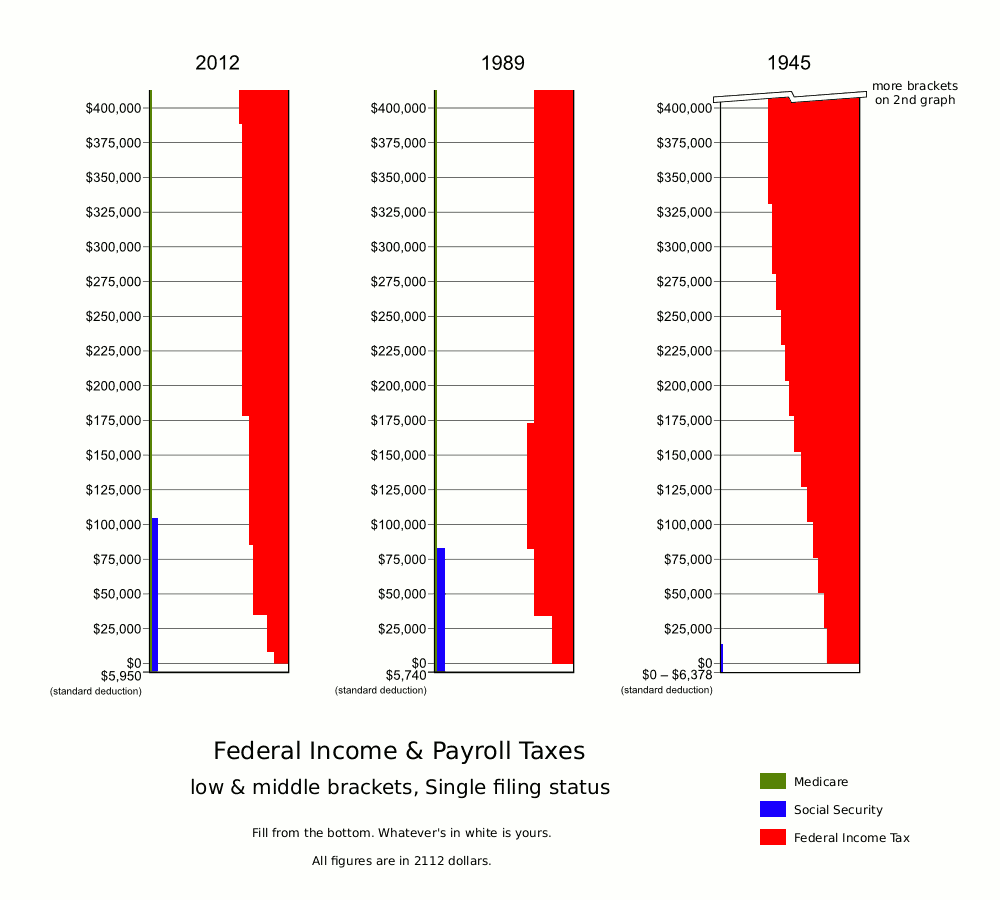
There’s been a lot of talk in recent months about how huge tax rates fixed our economy in previous dire times. There’s been lots of other talk about how they weren’t as high as some people lead us to believe. So I actually looked at some historical tax brackets via taxfoundation.org and irs.gov .
I learned a thing or two along the way.
- The IRS has PDFs of tax forms online going all the way back to 1913 (plus one from 1864).
- We got the concept of the standard deduction from France.
- The Form 1040 instructions were only four pages long in 1945.
- Tax rates aren’t the only thing that matters. Where brackets start and stop is just as important.
- Raw bracket info doesn’t tell the whole story. There are often complications that must be taken into account if you want to determine your exact tax rate.
- In 1989, there were officially only two tax brackets: 15% and 28%. But there was also a surtax on a midrange portion of the 28% bracket. As your income climbed into this sub-bracket, the surtax eventually canceled out the amount you “saved” by paying only 15% in the low bracket. The net effect was that, if you earned enough, you effectively paid a flat tax of 28% on everything.
- In 1945, there was an extra rule that you could never owe more than 90% of your total income, so eventually you got so far into the 94% bracket that you hit a breakpoint and your marginal rate dropped back to 90%.
- You don’t get to count deductions before calculating Social Security or Medicare taxes. I’m embarrassed to say I didn’t already know this.
- Generating good charts is hard. Doing it with the wrong tools is even harder. ( Actually, I already knew this, but got reminded of it in a big way.)
Oh, yeah. I made charts. Here and here:
http://i214.photobucket.com/albums/cc182/therealjeffa/tax-graphs-main_zps22c78aaf.png
http://i214.photobucket.com/albums/cc182/therealjeffa/tax-graphs-alt_zps65dbe75e.png
So what do these charts mean?
Probably very little. Let me explain.
For starters, why did I pick the years I did? Well, I picked 2012 because it’s current. I picked 1989 because so many recent tax arguments refer to the Reagan era. I picked 1945 because it’s one of those famous “taxes right after WWII went up to 90%” years.
Those are lousy reasons if you’re trying to come to a trustworthy conclusion about something. I could have picked three other sample years and created different implications about how things are, or how they’ve changed, or what taxes would look like if they were done “right”. Actually, the very fact that I only compare three sample years instead of five, or eight, or a long continuous series provides bias with another ton of leeway to creep in, whether I intend it or not.
Second, there’s too much information I don’t convey. The graphs cover only federal income and payroll taxes. They don’t cover sales taxes. They don’t cover taxes on capital gains. They don’t cover state & municipal taxes (and with good reason: that would add at least two orders of magnitude more work).
The graphs also assume you take the default standard deduction. No one who makes significant amounts of money does that. They itemize and get bigger exemptions. More importantly, what kinds of things could be written off has changed significantly over the decades. Unless you are a financial historian, I bet you have nowhere near an accurate idea how much taxable income a person from 1945 would have as a result of taking home a million dollar paycheck.